About Cat Robson  View Catherine Robson’s profile
Currently a Manager of User Experience at Red Hat, I focus on building great teams who can bring user experience expertise to projects in a way that improves their product deliverables through focused requirement definition, targeted user research, efficient development time, and good design and usability principles.
User Research
SeaChange – Advanced Advertising
SeaChange was looking into what the full advertising workflows of the users looked like as we entered the VOD advertising industry with the groundbreaking AdPulse product. The goal was to get information that could be relevant to both linear and VOD advertising, as well as the business areas that we we currently not supporting in these products related to advertising. The user research included remote interviews as well as two customer site visits to gather information.
- Research Plan
- Finding for existing products
- Advanced Advertising Research Report
- Advanced Advertising Whitepaper
Personas
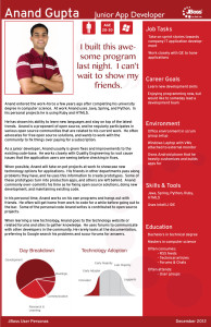
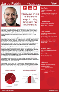
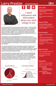
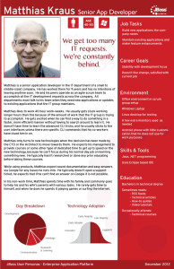
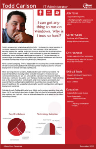
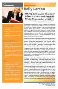
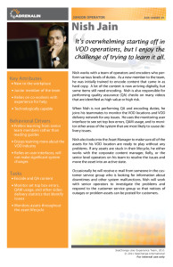
Red Hat – JBoss Personas
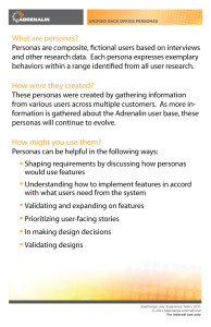
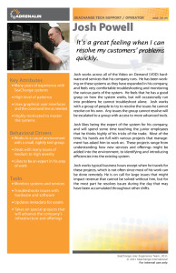
SeaChange – Adrenalin Personas
Product Design
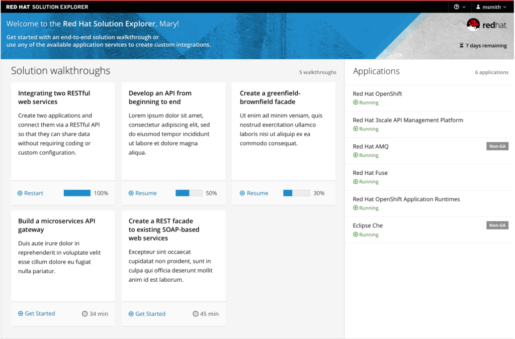
Red Hat Integration Solution Explorer
A challenge many companies face is that users commonly use multiple products, and how to educate, document, and design across these experiences is not always clear given organizational structures. At Red Hat, I helped initiate a project where we built a solution explorer that allowed users to see how Red Hat Integration products (Red Hat Fuse, Red Hat AMQ, Red Hat 3Scale, and more) could solve their end to end integration use cases they experienced in their IT, and how each product could be used to solve the individual use cases of that overall solution. I led a team of researchers, designers, and developers to create this application within 2 months so we could resolve our Sales team’s pain points for future quarters.
Red Hat Fuse Online
Red Hat Fuse had a competitive challenge where our capabilities were more liked by customers once they learned the technology and were using it in practice, but the learning curve of the technology was too steep to begin with and didn’t enable quick wins for customers. I lead a team of designers, researchers, and developers to design a new web user interface that would be the entry point for Red Hat Fuse users to adopt Fuse technologies and create their first integrations. This capability moved the product significantly in the Gartner quadrants for future years. [Screenshot from upstream open source community to Red Hat Fuse Online – Syndesis]

Pattern & Style Guide Libraries
PatternFly
At Red Hat, the team created an open source pattern library that we were the primary contributors to. Across my teams, we consume and contributed to this pattern library on a regular basis. As part of the UX Leadership team, I also helped guide and lead the PatternFly project towards its success.
SeaChange Style Guide & Patterns
With many new products on the SeaChange horizon, the UX team had the opportunity to create a brand new user experience for the future SeaChange products. This initiated many projects for the team, including the development of interaction patterns that the user experience team would use to maintain consistency in the new product design, a style guide that captured the intersection of these interaction patterns the the visual design, and a UI framework that built standard code snippets that various development groups could re-use in the product development to maintain UI consistency and save development time.
Usability Testing
SeaChange – Propagation UI
In the flagship SeaChange Video on Demand software, Axiom, there is a component called the Propagation Service that is responsible for copying videos to edge video servers for streaming in a timely and efficient manner. Previously, this was a black box service, users had very little view into what this service was doing and why. The Propagation UI was created to help our users (the VOD operator, such as Comcast) monitor and manage their video propagation.
The product was built upon User Experience direction prior to my arrival at SeaChange. I came onto the team to perform usability testing that would look to fix any issues prior to release. Internal and external users were tested in person and remotely.
